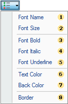
It is possible to enable/disable visual styles of a component using the conditional formatting. Enabling/disabling visual styles can be done in the visual styles menu. This menu provides the ability to make choice of those visual styles of the component, which will be applied to it for triggering the condition. The picture below shows the menu of visual styles:
 The
Font Name
menu
item. Enabling/Disabling this item provides an opportunity to
change/not change the font in the components that match the
condition. If this menu item is disabled (not checked), the font
will not be changed, i.e. will remain by default;
The
Font Name
menu
item. Enabling/Disabling this item provides an opportunity to
change/not change the font in the components that match the
condition. If this menu item is disabled (not checked), the font
will not be changed, i.e. will remain by default;
 The
Font Size
menu
item. Enabling/Disabling this item provides an opportunity to
change/not change the font size for components that match the
condition. If this menu item is disabled (not checked), then the
font size will not be changed, i.e. will remain by
default;
The
Font Size
menu
item. Enabling/Disabling this item provides an opportunity to
change/not change the font size for components that match the
condition. If this menu item is disabled (not checked), then the
font size will not be changed, i.e. will remain by
default;
 The
Font Bold
menu
item. Enabling of this item provides an opportunity to use bold
font for the components that match to the condition. If this menu
item is disabled (not checked), the font style will not be changed,
i.e. will remain by default;
The
Font Bold
menu
item. Enabling of this item provides an opportunity to use bold
font for the components that match to the condition. If this menu
item is disabled (not checked), the font style will not be changed,
i.e. will remain by default;
 The
Font Italic
menu
item. Enabling of this item provides an opportunity to use italic
font for the components that match to the condition. If this menu
item is disabled (not checked), the font style will not be changed,
i.e. will remain by default;
The
Font Italic
menu
item. Enabling of this item provides an opportunity to use italic
font for the components that match to the condition. If this menu
item is disabled (not checked), the font style will not be changed,
i.e. will remain by default;
 The
Font Underline
menu
item. Enabling of this item provides an opportunity to use the
underlined font for components that match to the condition. If this
menu item is disabled (not checked), the font style will not be
changed, i.e. will remain by default;
The
Font Underline
menu
item. Enabling of this item provides an opportunity to use the
underlined font for components that match to the condition. If this
menu item is disabled (not checked), the font style will not be
changed, i.e. will remain by default;
 The
Text Color
menu.
Enabling of this item provides an opportunity to apply the text
color for the components which correspond to the condition. If this
menu item is disabled (not checked), the color of the text will not
be changed, i.e. will remain by default;
The
Text Color
menu.
Enabling of this item provides an opportunity to apply the text
color for the components which correspond to the condition. If this
menu item is disabled (not checked), the color of the text will not
be changed, i.e. will remain by default;
 The
Back Color
menu
item. Enabling of this item provides an opportunity to apply the
background color for the components that match to the condition. If
this menu item is disabled (not checked), then the background color
will not be changed, i.e. will remain by default;
The
Back Color
menu
item. Enabling of this item provides an opportunity to apply the
background color for the components that match to the condition. If
this menu item is disabled (not checked), then the background color
will not be changed, i.e. will remain by default;
 The
Border menu
item. Enabling of this item provides an opportunity to change the
borders of components. If this menu item is disabled (not checked),
the borders of a component will not be changed, i.e. will remain by
default;
The
Border menu
item. Enabling of this item provides an opportunity to change the
borders of components. If this menu item is disabled (not checked),
the borders of a component will not be changed, i.e. will remain by
default;